
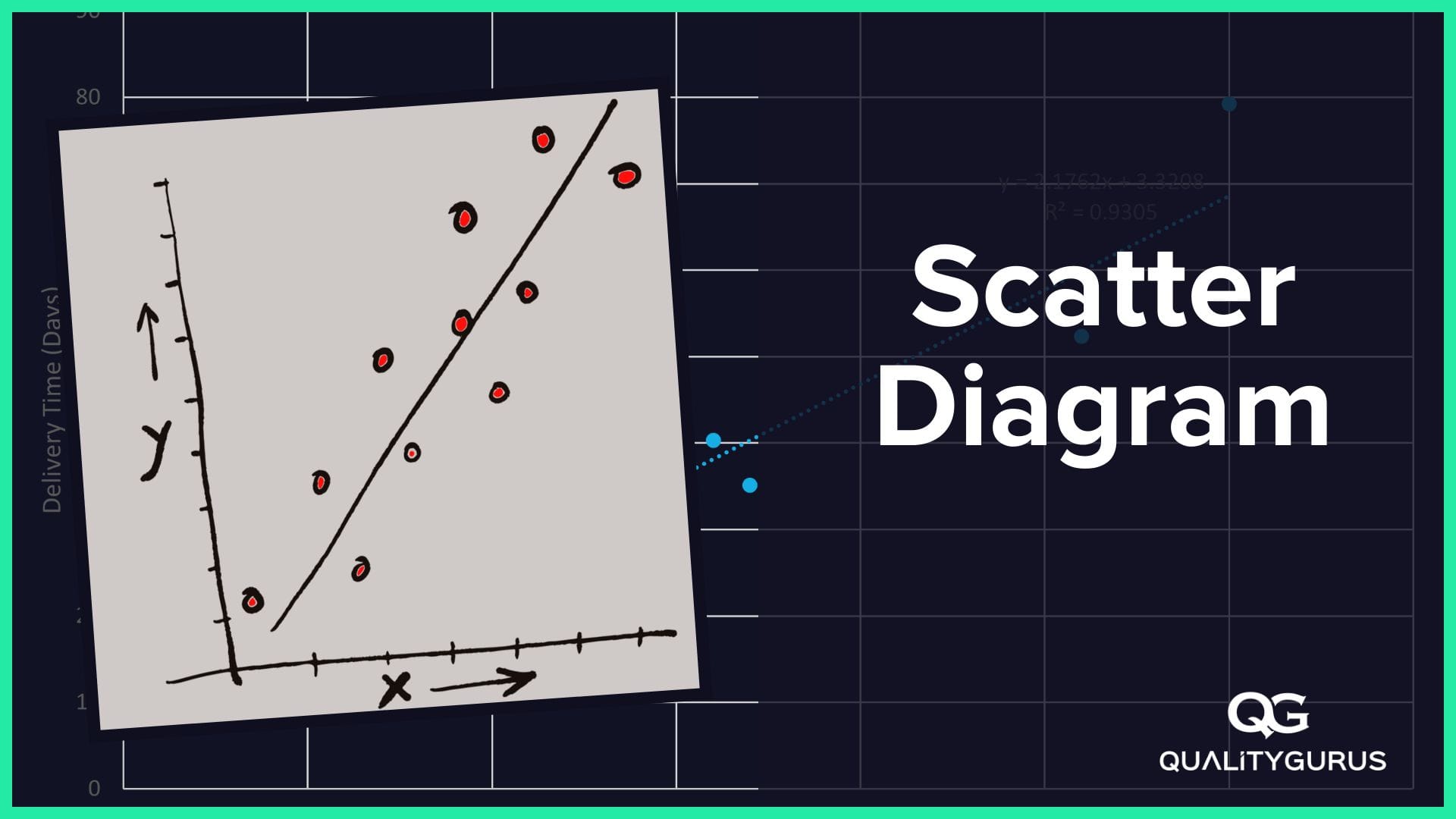
A Scatter diagram is one of the Seven Basic Quality Tools. It plots two sets of observations against each other; the horizontal axis represents one set of observations (independent variable) while the vertical axis represents the second set of observations (dependent variable).
Scatter diagrams allow you to examine relationships between variables visually. Both of these variables should be continuous variables.
They are a powerful way to visualize and explore data, especially when there is no apparent linear relationship. You can also use them in conjunction with statistical tests such as correlation analysis or regression analysis.
When to Use Scatter Diagram?
You can use a Scatter Diagram (or Scatter Plot, Scatter Chart, Scatter Graph) when you have data in the form of pair, and you want to check the degree of relationship between them.
For example, you have a dataset for 50 students in the class, including the number of hours studied and marks obtained in the exam. Using this dataset, you can evaluate the relationship between these two variables (number of hours studied and marks obtained). In addition, you can find the direction (positive, negative, or no relationship) and the degree of relationship (correlation coefficient between +1 and -1) as well.
Correlation Coefficient
A correlation coefficient measures how closely related two variables are. The higher the value, the stronger the positive correlation between the variables. The value of the correlation coefficient varies from +1 to -1.
Positive correlation: When two variables increase together. In the ideal case, the correlation coefficient value will be +1.
Negative correlation: When two variables decrease together. In the ideal case, the correlation coefficient value will be -1.
No correlation: When there is no relationship between two variables. In the ideal case, the correlation coefficient value will be 0.
What Are the Good Features of a Scatter Diagram?
Quality practitioners use a Scatter diagram to understand the relationship between two variables. It allows them to see how one variable (independent) affects the other variable (dependent). The following features make a Scatter Diagram an excellent visualization tool.
1. Has an Attractive Graphic Appearance
The Scatter Diagram has a very attractive graphic appearance, making it easy to understand the data being represented.
2. Can Be Used With Any Number of VariablesYou can use any number of independent and dependent variables to create a scatter plot. For instance, you can add more than two variables to your scatter plot. This makes it possible to compare many different relationships between variables. For more than two variables, you can use different colours for the points or different sizes of the point (Bubble Plot).
3. Provides Visual Support for Analysis
Scatter plots provide visual support for the analysis of the data. After creating a Scatter Plot, you can perform statistical tests such as correlation, regression, and clustering. These analyses can help you better understand the relationships between the variables.
4. Easy to Interpret
If you look at the scatter plot, you can immediately get an idea about the relationship between the variables. There is no need to do complicated calculations and statistical analysis. All you need is eye-balling the scatter plot.
5. Efficient Communication Tool
Visualization tools like Scatter Plots allow you to share information with others without wasting their time on lengthy explanations. They also enable you to communicate your findings quickly.
Correlation is not Causation.
It is crucial to remember that even though two variables may seem correlated, this does not necessarily mean they have a cause-and-effect relationship.
Tools for creating a Pareto Chart
Various tools can be used to create a Scatter Diagram.
1. Manual: Using a pen and paper: This method can work only if the data is small.
2. Microsoft Excel: This is the most common tool used to create a Scatter Diagram. All tools listed here (except the manual method) have the ability to perform advanced calculations as well, such as finding the correlation coefficient, regression line and the coefficient of determination.

3. Minitab: Minitab is advanced statistical software Six Sigma professionals use. You can draw a Scatter Diagram using Minitab.

4. Python: Python is a programming language that can be used for many different purposes. It is one of the most popular languages used today for data analysis. You can draw publication quality and professionally looking Scatter Diagram using Python.

5. R Programming: R is a programming language used for complex statistical analysis. Like Python, you can use R Programming to draw publication quality Scatter Diagram.

Conclusion
A Scatter Diagram is a useful visualization tool. It provides visual support for the analysis. In addition, it helps you easily communicate your findings.