
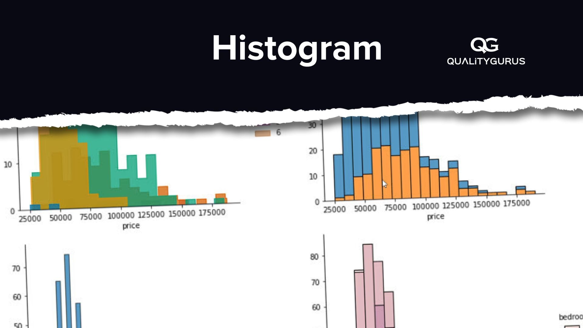
Histograms are often used to display the distribution of data. The histogram is shown as a series of vertical bars representing the frequency or relative frequency of data values, with the height of the bar being proportional to the quantity of data it represents.
Histograms are a visual representation of the distribution of data and can show you what is happening with your data across different intervals. Histograms provide an easy way to identify patterns and outliers in data and determine potential problems.
What Is a Histogram?
The histogram is one of the Seven Basic Quality Tools.
A histogram is an easy-to-use tool for visualizing the distribution of data points in a dataset. It can quickly identify outliers, find patterns and spot trends.
What is a Histogram Used for?
Histograms are useful for detecting patterns and trends in data. They also provide insight into the nature of the data. In general, they are good tools for:
• Finding the central tendency of a set of data.
• Spotting outliers.
• Determining whether the data is normally distributed or skewed.
• Finding unusual events.
• Analyzing the variance of a set of data points.
• Detecting anomalies.
• Visualizing large datasets.
What Are the Five Good Features of a Histogram?
The following seven features make a histogram an excellent visualization tool.
1. Easy to Understand and Interpret
You can understand a histogram in just seconds. It's really simple to read and interpret.
2. Quickly Visualized
Because a histogram is simple to create, you can quickly generate it. That makes it easy to spot trends and anomalies.
3. Helps You Detect Trends
When you see a histogram, you usually want to know where the peaks and valleys are located. This helps you detect trends.
4. Helps You Identify Anomalies
An anomaly occurs when a new event takes place. If you look at a histogram, you may notice a spike or dip in one of the bars. This tells you that an event took place in that data range.
5. Great For Large Datasets
Histograms are great for analyzing large datasets because they don't take up much space on the screen. You can easily visualize thousands of data points without having to scroll around.
Tools for creating a histogram
Various tools can be used to create a histogram.
1. Manual: Using a pen and paper: This method can work only if the data is small.
2. Microsoft Excel: This is the most common tool used to create a histogram.

3. Minitab: Minitab is advanced statistical software Six Sigma professionals use. You can draw a histogram using Minitab.

4. Python: Python is a programming language that can be used for many different purposes. It is one of the most popular languages used today for data analysis. You can draw publication quality and professionally looking histograms using Python.

5. R Programming: R is a programming language used for complex statistical analysis. Like Python, you can use R Programming to draw publication quality histograms.

Conclusion
Histograms are a valuable tool in quality management. By using a histogram, you can see accurate data trends, compare groups of data, and identify outliers. These features can help in identifying and quantifying quality issues in a process.